
UNITED BANK OF AFRICA
Streamlining Financial Transactions for Hassle-Free Banking.
PROJECT OVERVIEW
Over the years, mobile banking has been a service that banking institutions all over the world offer to their clients in order to make it easy for them to access their accounts and perform variety of transactions using a mobile device such as smartphones or tablets when the users are connected to the internet .
With over 20 million customers, and growing operations in 20 African nations, as well in the United States of America, United Kingdom, and France, the goal of United Bank of Africa (UBA) is to become the top financial services provider in the continent. Although United Bank of Africa provides financial services that are among the best in the industry, the mobile banking app has suffered series of setbacks with design, functionality as well as the user experience and these could be improved on to give every user the best possible experience.
The purpose of this project is to provide justification for the redesign of the bank’s mobile application, give visual and structural recommendations as well as test with target users in order to achieve a seamless experience for all users.
INITIAL RESEARCH
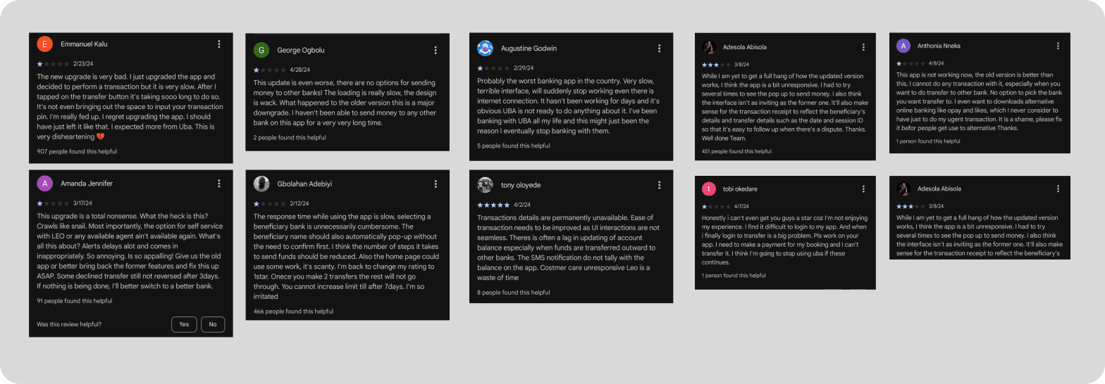
An initial research was conducted to understand better what users of the app have been complaining about. Feedbacks were collated from Google Playstore as well as Appstore to see people’s ratings and comments about the UBA banking app and its usability.
Most of the frequents comments ranged from inability to login easily, view transactions history, to difficulty in performing transactions like transfers, airtime top-up among others.
CHOSEN EVALUATION TECHNIQUES
In order to detect any issues and improve the UBA mobile banking app, formative testing was carried out using the System Usability Scale (SUS), tasks and severity survey and the product reactions card technique. These methods were chosen to provide both qualitative and quantative feedbacks which is important for this project.
After conducting the formative testing and redesigning the application, summative testing was carried out to ensure all the earlier stated usability issues have been sorted out. The methods used for this are the SUS, product reaction cards as well as the task and severity survey because comparing the results with the formative testing results was easier.
FORMATIVE TESTING
The formative testing was conducted with 30 participants from different parts of Africa. The participants are frequent users of the mobile banking app therefore their responses were of benefit to the project.
Task and Severity Survey: Using Jakob Nielsen variation, the task and severity questionnaire containing 4 tasks with severity rating from no usability problem to usability catastrophe was shared through an editable PDF and the results were analyzed.
The System Usability Scale: Using the system usability scale developed by John Brooke, a likert scale with ten items that particpants are expected to answer, the questionnaire was shared through an editable PDF and the results were equally analyzed.
Product Reaction Cards: Using product reaction cards, participants were provided with collection of words to choose from to best reflect their experiences with the mobile banking app. Their responses were analyzed afterwards.
FORMATIVE RESULTS
47.5
(LOW)
31.5
(LOW)
System Usability Scale (SUS)
32.0
(LOW)
Product Reaction
Cards
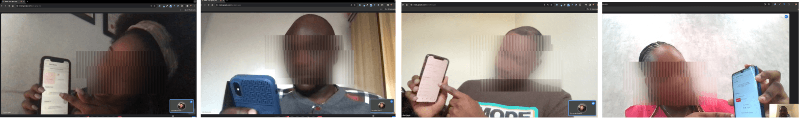
FOLLOW UP SESSIONS
Following the tests submission, using Google Meet, a session was held individually with all the participants providing comments about what they liked on the banking app, what they did not like and recommendations on what they would like to have on the app.
FEEDBACKS
Based on the feedbacks provided, it was quite important to improve on the layout of items in the app, the font styling as well as the spacing. The main recommendations provided are;
Login: Make login easier and stress free for users
Home: Provide better arrangement for the homepage
Transaction: Simplify transaction history view for users
Money transfer : Simplify the money transfer flow
Airtime Topup: Simplify the airtime recharge flow
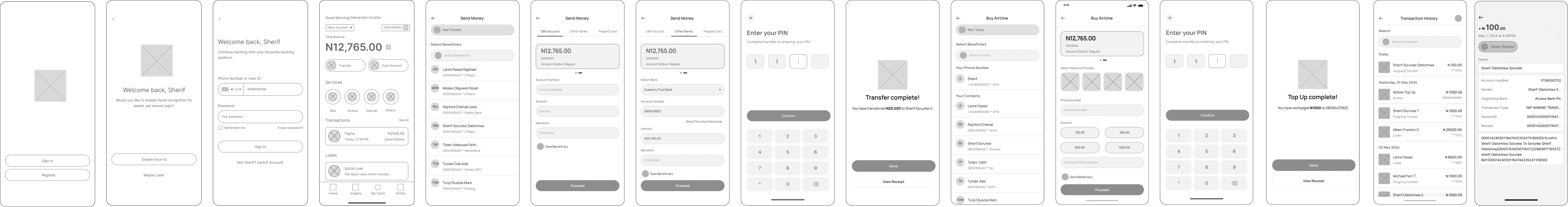
EXISTING SCREENS
Below are the screenshots of the original mobile design. The screens are arranged according to different tasks ; The login screen, money transfer screen, transaction history as well as airtime recharge screen. The app has other screens but the key screens are what is being displayed.
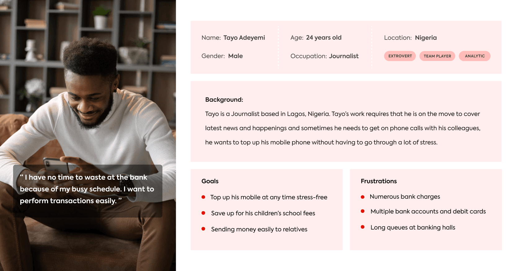
USER PERSONAS
User personas were created. User personas are fictional characters that speak to a specific subset of your target market's requirements and desires. By adding a human element to your user research and actual data, user personas help you generate more comprehensible representations of your audience's preferences.
LOW FIDELITY WIREFRAMES
The low fidelity wireframes shows the login flow with added features, the money transfer , airtime top up flow as well as transaction view screen. Here are some of the screens.
DESIGN ITERATIONS
(WHAT CHANGED)
The visual and organisational changes made to the UBA mobile app were documented. These are major changes made, other minute design changes are not shown here. The palette was derived from the existing app design and simplified while still maintaining the original brand colour .
SPLASH PAGE
Logo: Retained the bank logo structure but amended the feel with a clear and refined version
Login / Register buttons: Represented the “login” with a primary button being the primary action for existing users, and the “register” as secondary button.
LOGIN
Face ID : Added the face ID feature which is equally a secure and faster measure of accessing the mobile banking app
HOME
Copy Icon : Added the copy icon to the account number
Dropdown option: Simplified the account type switching from Naira account to dollars and so on using the dropdown option
Transfer Money Button: Changed the “send money” icon to a more pronounced button with icon on it.
Fund Account Button: Moved the “fund account” feature to a more noticeable position on the homepage, representing it with a button with icon on it
Services: Rearranged the services section, added the “others” icon to show full list of other services.
Transactions: Displayed the most recent transaction on the homepage and “see all” to view entire list of transactions.
Loans: Repositioned the loans card from side alignment to span fill container
Navigation tabs: Increased the tabs to allow more access to other sections of the app.
TRANSFER MONEY
Pay New: Added a new screen with “send to new” button and list of beneficiaries and a search function to search for beneficiaries.
Tabs: Simplified the bank groups selection from cards to tabs
Input fields: Added well listed input fields for easier transfer details inputting.
Toggle icon: Added toggle to save or remove a beneficiary during a transaction.
AIRTIME TOP-UP
New Top up: Added a new screen with “new top up” button and list of beneficiaries and a search function to search for beneficiaries.
Cards: Changed account type display to cards which allows switch between the account to use during a transaction. Also displayed service providers with cards and their logos.
Toggle icon: Added toggle to save or remove a beneficiary during a transaction.
AIRTIME TOP-UP
Sort: Re-organized transactions day by day with each day transactions having the date at the top of the list
Filter and search: Added filter and search feature to make it easier to search through the transactions history.
Share: Added share feature to allow user share the receipt to other devices or platform.
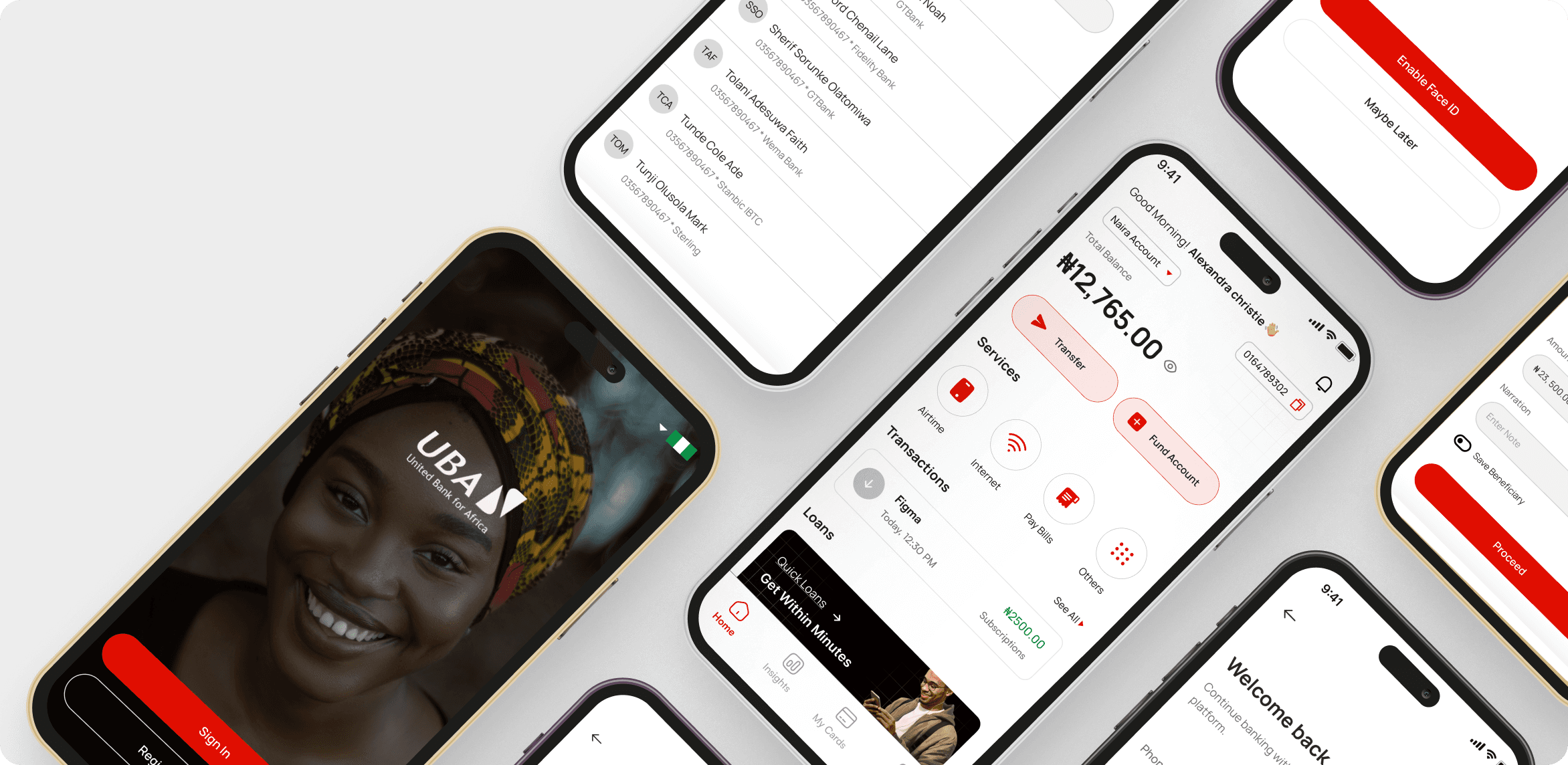
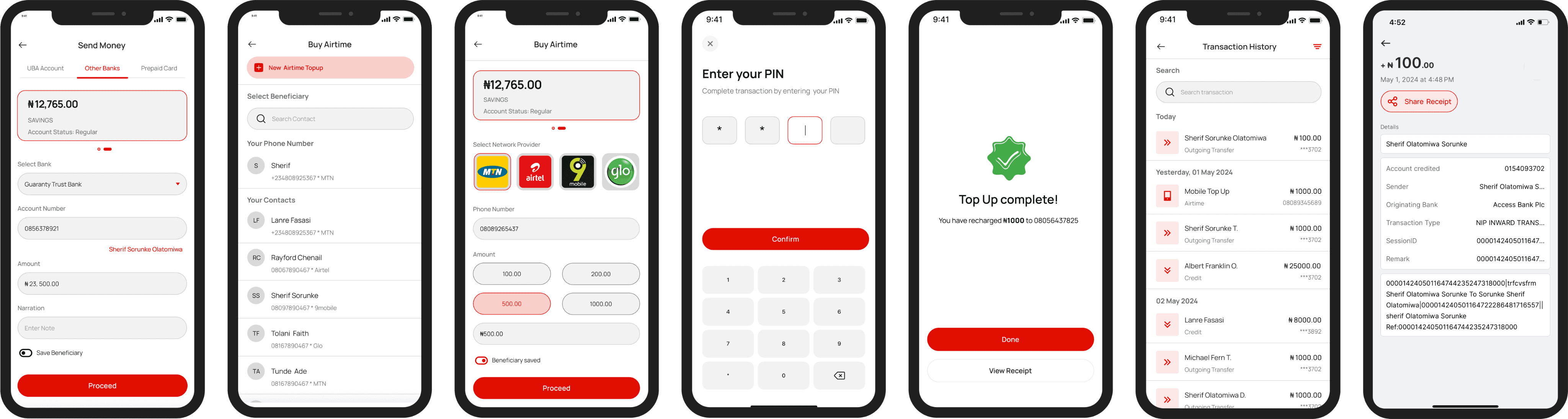
HIGH FIDELITY WIREFRAMES
The high fidelity wireframes shows the login flow with Face ID feature, the money transfer , airtime top up flow as well as transaction view screen. Here are some of the screens.

SUMMATIVE TESTING
The summative testing was conducted with 30 participants from different parts of Africa. The participants are frequent users of the mobile banking app therefore, their responses were of benefit to the project.
Task and Severity Survey: Using Jakob Nielsen variation, the task and severity questionnaire containing 4 tasks with severity ratings from no usability problem to usability catastrophe was shared through an editable PDF and the results were analyzed.
The System Usability Scale: Using the system usability scale developed by John Brooke, a Likert scale with ten items that participants are expected to answer, the questionnaire was shared through an editable PDF, and the results were equally analyzed.
Product Reaction Cards: Using product reaction cards, participants were provided with a collection of words to choose from to best reflect their experiences with the mobile banking app. Their responses were analyzed afterwards.
FORMATIVE RESULTS
93.75
(GOOD)
96.5
(GOOD)
System Usability Scale (SUS)
88.0
(GOOD)
Product Reaction
Cards
RESULTS COMPARISON
The increase in score from formative testing to summative testing results shows that there is a
positive trend in the usability of the mobile banking app, that is, there has been improvements in the usability of the system which will ultimately lead to a better user experience.
RECOMMENDATIONS
The redesign of the mobile banking was based on Apple iOS standard. In order to test if the redesign is usable on other devices with different layouts, redesign should also be done based on layout and tested to see if equal positive results would be gotten. The goal is to ensure all users with varying devices enjoy seamless user experience.
Also, the summative testing was based on the high fidelity prototype hence the functionality was limited. For precise understanding of user’s view, another round of testing may also be carried out after the app has been developed.